


Table of contents
Creating a Modern Image Slider Using HTML, CSS, and Vanilla JavaScript
In this tutorial, we will build a modern image slider from scratch using HTML, CSS, and Vanilla JavaScript. Image sliders are a popular feature on websites for showcasing multiple images or content in an interactive way. We will create a responsive and user-friendly slider with smooth transitions and navigation buttons.
HTML Structure
First, let's set up the HTML structure for our image slider. We'll create a container for the slider, navigation buttons (left and right), and a space to display images.
<div id="container" class="dark">
<div class="modeBtn">
<input type="checkbox" id="darkMode">
<label for="darkMode"></label>
</div>
<div id="slider-wrapper">
<div id="slider-container">
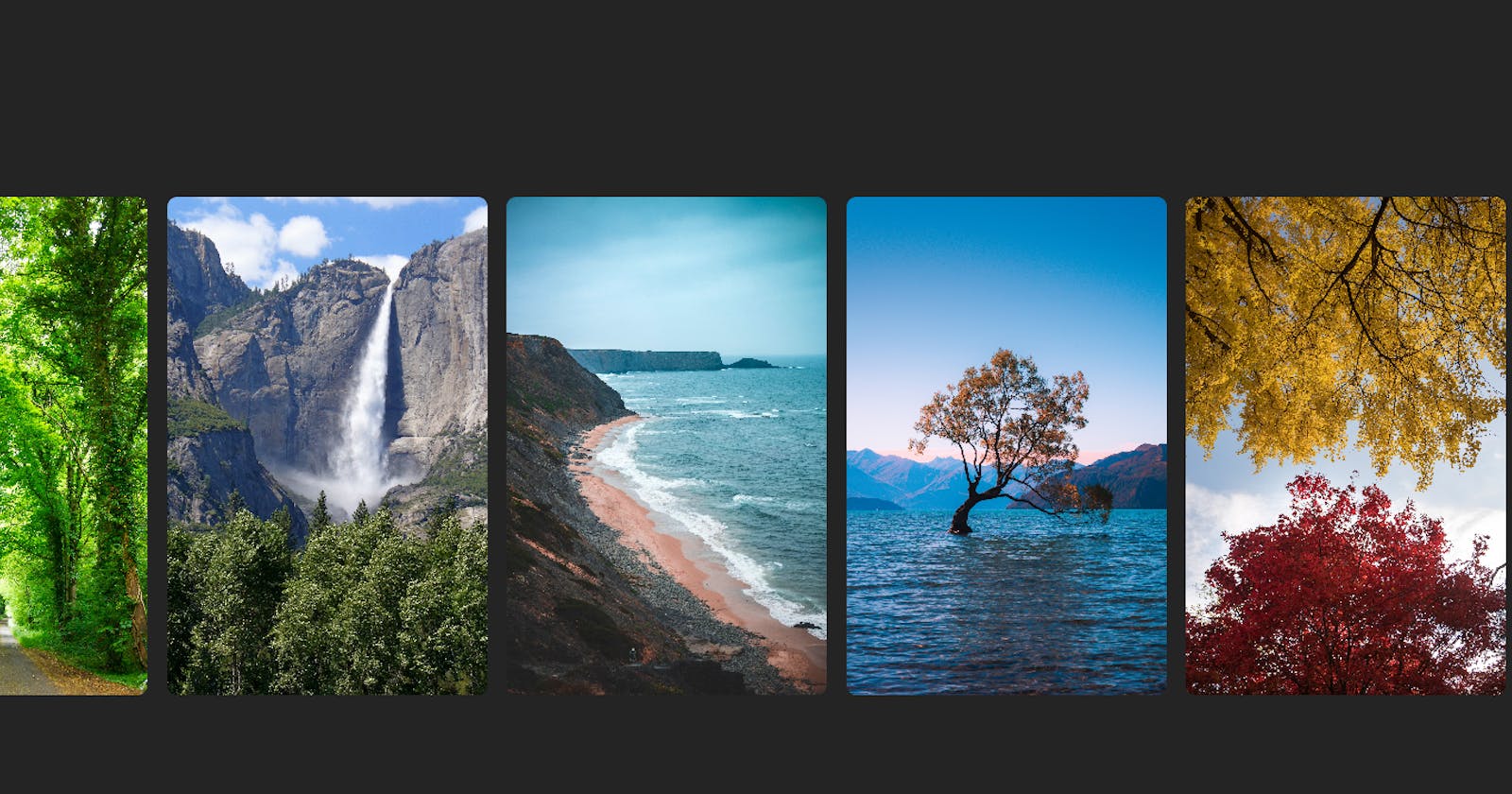
<img class="slide" src="" alt="" loading="lazy">
<img class="slide" src="" alt="" loading="lazy">
<img class="slide" src="" alt="" loading="lazy">
<img class="slide" src="" alt="" loading="lazy">
<img class="slide" src="" alt="" loading="lazy">
<img class="slide" src="" alt="" loading="lazy">
<img class="slide" src="" alt="" loading="lazy">
</div>
<button class="sliderBtn arrowBtn" id="left">
<i class="fa-solid fa-arrow-left"></i>
</button>
<button class="sliderBtn arrowBtn" id="right">
<i class="fa-solid fa-arrow-right"></i>
</button>
</div>
<div class="popModel">
<div id="overlay">
<div id="popContainer">
<img id="modelImage" src="" alt="" loading="lazy">
</div>
<button class="sliderBtn" id="closePopModel">
<i class="fa-solid fa-xmark"></i>
</button>
</div>
</div>
<div class="copyright"><p>Made With <a href="#">❤️</a> By
<a href="https://jaimindev.blogspot.com">Jaimin Patel</a></p></div>
</div>
In this structure, we have a .slider-container that includes the navigation buttons (#prevBtn and #nextBtn) and a .slider div where our images will be displayed. You can add more images as needed.
CSS Styling
Now, let's style our image slider using CSS. We'll create a basic style for the slider, buttons, and transitions.
.modeBtn label {
    width: 4.5rem;
    height: 2.3rem;
    position: relative;
    display: block;
    background-color: aliceblue;
    border-radius: 200px;
    box-shadow: inset 0px 5px 15px rgba(0, 0, 0, 0.4) inset 0px -5px 15px rgba(255, 255, 255, 0.4);
    cursor: pointer;
    transition: 0.3s;
   }

   .modeBtn label:after {
    content: '';
    width: 2rem;
    height: 2rem;
    position: absolute;
    top: 2px;
    left: 6px;
    background: linear-gradient(180deg, #ffcc89, #d8860b);
    border-radius: 50%; /* Changed from 180px to 50% for a circular shape */
    box-shadow: 0px 5px 10px rgba(0, 0, 0, 0.2);
    transition: 0.3s;
    }

    .modeBtn input {
    width: 0;
    height: 0;
    visibility: hidden;
    }

/* Updated the selector here */
    .modeBtn input:checked + label:after {
    left: calc(100% - 36px); /* Adjusted the left position to move it to the right */
    background: linear-gradient(180deg, #777, #3a3a3a);
     }

    /* Added a style for the dark background when checked */
    .modeBtn input:checked + label { background: #242424; }

    .dark{ background: #242424; }
    /* Added a style for the dark background when checked */
    .light { background: #dcd6d6; }
In this CSS code, we set up the slider container, define styles for images, and position the navigation buttons (#prevBtn and #nextBtn) on the left and right sides of the slider.
JavaScript Functionality
Now, let's add JavaScript to make our image slider functional. We will implement navigation and handle automatic sliding.
const initSlider = () => {
        const sliderBtn = document.querySelectorAll('.arrowBtn');
        const imageList = document.querySelector('#slider-container');
        const maxScrollLeft = imageList.scrollWidth - imageList.clientWidth

        sliderBtn.forEach((button) => {
            button.addEventListener('click', () =>{
                const direction = button.id === 'left' ? -1 : 1;
                const scrollAmount = imageList.clientWidth * direction;
                imageList.scrollBy({
                    left : scrollAmount,
                    behavior : 'smooth'
                });

                imageList.addEventListener('scroll', () => {
                    sliderBtn[0].style.display =
                     imageList.scrollLeft <= 0 ? 'none' : 'block';
                    sliderBtn[1].style.display =
                     imageList.scrollLeft >= maxScrollLeft ? 'none' : 'block';
                })

            })
        })
        };

        window.addEventListener('load', initSlider)

        const imageSlide = document.querySelectorAll('img');
        const popModel = document.querySelector('.popModel');
        const closeModel = document.querySelector('#closePopModel');
        const images = document.querySelectorAll('#slider-container img');
        const modelImage = document.querySelector('#modelImage');
        const ModeBtn = document.querySelector('#darkMode');
        const container = document.querySelector('#container')
        const copyright = document.querySelector('.copyright')

        imageSlide.forEach((img) => {
            img.addEventListener('click', (e) => {
                popModel.classList.add('active');
                modelImage.src = img.src;
            })
        });

        closeModel.addEventListener('click', (e) => {
            popModel.classList.remove('active');
            modelImage.src = '';
        })

        ModeBtn.addEventListener('click', () => {
            if (container.classList.contains('dark')) {
                container.classList.replace('dark', 'light');
                copyright.style.color = 'black'
                imageSlide.forEach((img) => {
                    img.style.boxShadow = "rgb(152 152 152 / 20%) 0px 8px 24px";
                });
            } else if (container.classList.contains('light')) {
                container.classList.replace('light', 'dark');
                copyright.style.color = 'white'
                imageSlide.forEach((img) => {
                    img.style.boxShadow = 'none';
                });
            }
        })
In this JavaScript code:
We define functions to move to a specific slide, handle next and previous slides, and implement automatic sliding.
Event listeners are added to the next and previous buttons to navigate the slider.
We use
setIntervalto trigger automatic sliding every 3 seconds.Finally, we call
moveToSlideto set the initial slide.
Conclusion
Congratulations! You've successfully created a modern image slider using HTML, CSS, and Vanilla JavaScript. You can further enhance this slider by adding additional features like captions, slide indicators, or custom animations to suit your project's needs.